
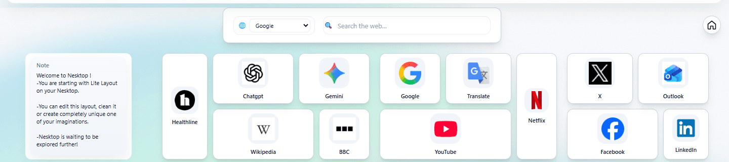
Customizing your NESKTOP desktop: widget styling, colors, gradients, dark mode, and backgrounds
Many widgets on your NESKTOP canvas support individual color and style controls. Plus global dark mode, text size controls, alignment grids, and backgrounds on pages allowed by your account's plan background-page limit.
Per-widget color and style controls
Use a widget's canvas context menu to choose its color, adjust the gradient strength, set the darkness, control the text darkness, and use gradient mirroring. These controls let you tune each widget's visual weight without changing its content. No two desktops need to look the same.
Make your desktop yours
Choose your colors, set your theme, pick a background — your desktop, your style.
Try it freeDark mode and light mode — system-wide and always available
NESKTOP supports both dark and light themes. Select either theme explicitly from the canvas top bar or the Preferences page. Dark mode inverts the canvas background and widget colors for comfortable use in low-light environments. The theme applies across your entire NESKTOP experience — canvas, settings, support, and all pages.
Text size that fits your eyes
Choose from five text sizes: Extra Small, Small, Normal, Large, and Extra Large. The size applies globally across your NESKTOP interface. Whether you prefer a compact information-dense desktop or larger, easier-to-read text, the setting is yours. Set it once in Preferences and it persists across sessions.
Backgrounds and the alignment grid
Pages can use their own background when allowed by your account's plan background-page limit — choose from built-in background presets with different visual styles. Set the background to Cover (fill the canvas) or Tile (repeat pattern). Toggle the alignment grid on or off to help with precise widget placement. The background picker shows the presets available to your account, and the number of pages you can give a background depends on your plan.
Comparison table
| Feature | Nesktop | Other approach |
|---|---|---|
| Widget styling | Color, gradient strength, darkness, text darkness, and gradient mirroring per widget | Most tools: no per-item styling |
| Dark mode | Full system-wide dark theme | Available in some tools, not all |
| Text size | 5 levels from XS to XL | Rarely adjustable in bookmark tools |
| Backgrounds | Backgrounds on allowed pages with cover or tile mode | Not available in most bookmark or start page tools |
FAQ
Can I save my customization settings?
Widget styles are saved as part of your layout. Theme, text size, and grid preferences persist across sessions automatically.
How do I choose a background for my desktop?
Open the background picker from your canvas — it shows the presets available to your account. Each page can have its own background when your plan allows it: the number of pages with backgrounds depends on your account's plan background-page limit. Set a background to Cover (fill the canvas) or Tile (repeat pattern), and toggle the alignment grid on or off to help with precise widget placement.
Related articles
Make your desktop yours
Choose your colors, set your theme, pick a background — your desktop, your style.
Continue