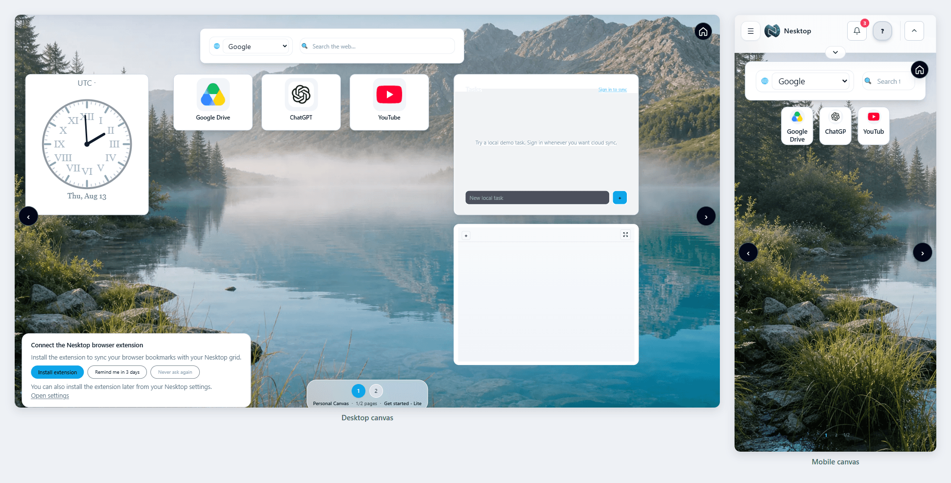
NESKTOP on desktop and mobile: one workspace, two independent canvases
NESKTOP gives you two separate canvases — Desktop for your computer and Mobile for your phone. Each is independently arranged — the canvases are not mirrored — but both sync to your account and are available wherever you sign in.
Why two canvases?
A desktop layout that looks great on a large 27-inch monitor does not translate well to a 6-inch phone screen. Widgets get cramped, text becomes tiny, and the arrangement that works with a mouse does not work with a thumb. NESKTOP solves this by giving you two completely independent canvases — Desktop (optimized for larger screens) and Mobile (designed for phone and tablet). Each canvas has its own set of pages, widgets, layouts, and backgrounds.
Set up both canvases
Design your Desktop canvas for your computer and your Mobile canvas for your phone — one account, two workspaces.
Try it freeThe Desktop canvas — your full-sized workspace
On your computer, use the Desktop canvas. This is where you can go big — arrange dozens of widgets on a spacious canvas (presets are designed at a 1440-pixel width, while a blank workspace adapts to your screen), create multiple pages for different contexts, and use the full desktop editing experience with drag-and-drop, resize handles, and detailed widget customization. This is your main workspace for serious organization.
The Mobile canvas — touch-friendly and focused
On your phone or tablet, the Mobile canvas takes over. It is independently arranged — you might have fewer widgets, a touch-optimized layout, a simplified hamburger menu, and independent pages and widgets per canvas. Your Desktop and Mobile canvases are both accessible from any device — switch between them using the canvas toggle in the top bar.
Comparison table
| Feature | Nesktop | Other approach |
|---|---|---|
| Desktop canvas | Presets designed at 1440px width, full editing, multiple pages, ideal for mouse/keyboard | A single responsive layout may become cramped on smaller screens. |
| Mobile canvas | Touch-optimized layout, simplified hamburger menu, independent pages and widgets | A desktop-first layout often needs zooming and horizontal movement. |
| Syncing | Both canvases sync to your account — access either from any device | Device-local start pages may require separate manual setup. |
FAQ
Can I access my Desktop canvas on my phone?
Yes. Use the canvas toggle in the top bar to switch between Desktop and Mobile canvases from any device. Both are always available.
Do I need to set up my Mobile canvas separately?
Yes. The Mobile canvas starts independently, which lets you design a phone-optimized layout from scratch. If you prefer, you can build a similar layout on both canvases.
Related articles
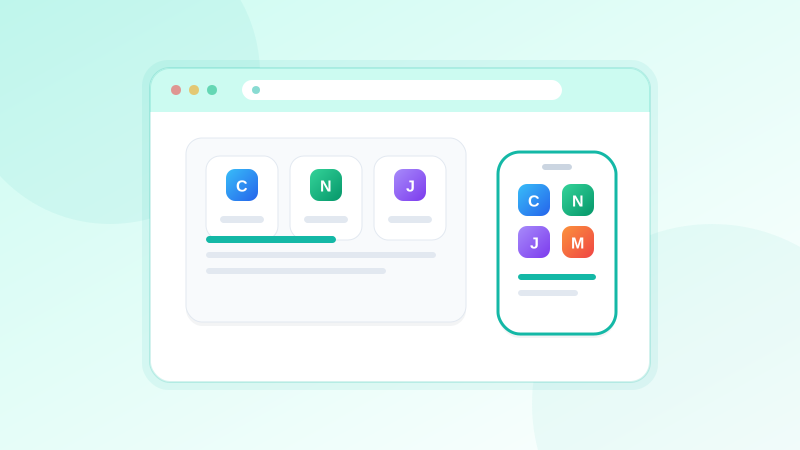
Set up both canvases
Design your Desktop canvas for your computer and your Mobile canvas for your phone — one account, two workspaces.
Continue